Hi - come on in and take a look at the downstairs. 
Ok, maybe this picture was from a while ago after I climbed around in the attic, but the following ones are brand spanking new.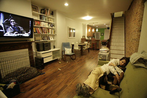
Notice the Queen and Wally snuggling on the couch as Joaquin Phoenix looks down on them. 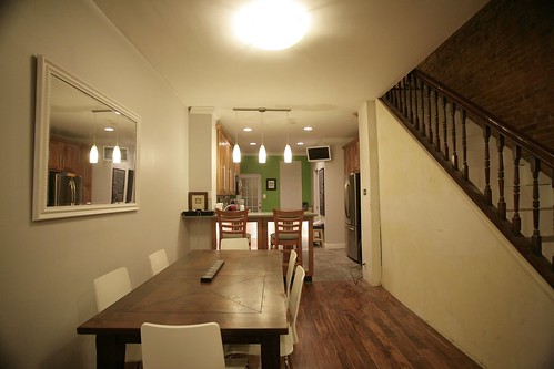
It feels great to actually have the mango dining table and white ikea chairs in the space. We think they look great and fit well into the small'ish space. 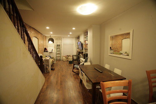
There is still work to be done, but it feels good to have the end in sight. :-)
Monday, January 12, 2009
Downstairs Reveal
![]()
![]()
Subscribe to:
Post Comments (Atom)

35 comments:
nice article. i suppose the position off the staircase is very well placed. the house seems to be long and beautiful
Your place is looking great! The green in the kitchen really helps to draw your eye. Your built-in shelving turned out great too. Can't wait to see it all done.
Looks great, I like the mirror over the table a lot. You're house appears to be about twice as wide as mine. I don't see any vents for HVAC in the ceiling, do you have them in the floor or bumpouts or am I just missing them? (I am assuming you have central air)
Wow what a beautiful job you have done! I really like where you put the half wall at the entry. Where did you get the light for the entry way?
Govindan - The stairs are somewhat unobtrusive, and by using a slim 30" wide table and low/thing chairs the dining space in the middle still feels open despite being only 9' wide.
Wanderluster - Thanks. Every so often we wonder about that wall, but it definitely draws your eye upward and ties in with the backsplash.
Patrick - The central air is run through bumpouts, in the walls and the floors, but no ceiling registers. We don't have enough registers for the optimal air flow throughout the house, but we can live with what we've got.
Thanks for the comment about the mirror. It was a craiglist snag for $50. It had a gold edge, that the queen spray painted over with primer and then white paint. It looks like a million buck now.
Jenny - Thanks! The light is from ikea, so it is quite affordable. It is a great light to use when watching TV, as it doesn't overwhelm the space. I'll go into more detail in a future post about all the layout changes made to make the space flow better, of which placing the knee wall was one of these decisions.
Hey, it's looking really good! Yeah, there's still work to do (isn't there always?) but savor victory where you can. It's better than not having anything to show for it.
The gift of the DIYer, we get rewards every time we walk in -- or out -- of our homes!
It looks fantastic! The space really looks bigger than I thought it would when you were describing it!
And, I also love the green wall- you're so much braver than I am (our house is varying shades of brown and beige!)!
I can't wait to see everything done!
Very impressive ... I love the look!
It looks lovely, but may I suggest pulling out your dining table a bit to be more centered in the space?
The current pictures may not be your final furniture arrangement, but as it is now, you've lined everything up along the walls and created a "bowling alley" down the middle. The room will actually look larger if you float pieces.
But congratulations on a great home reno job.
Lisa,
Funny you suggest that, as we had a disagreement about it! Corey's fancy lens make the space appear wider than it is. Since it is such a high traffic area, and Wally likes to play fetch up and down the length of the rowhouse, we decided to push it up against the wall a bit more. Eventually we want to get a rug to go under th table, which will help define the space more.
I'm with you Lisa - keep the discussion going and hopefully the Queen moves the table over. It makes me cringe a bit to see it pushed over that way so far. :-)
The space is 9' wide, and the table is 30" wide. If the table were centered it leaves 3'-3" on each side of the table, which I think is plenty. I'd also love to eventually hang to pendant lights over the dining area to help define the area, so this means the table position would have to be definitized. I also think wallpaper on that wall would really help define the space.
Love the new pics. Fisheye lens is so cool but pics can be a bit misleading as to how much space there is. Regarding table placement, if you consider the end of the eat-at counter as your "wall", you could the center the table in that space. There is no question that you can't infringe on the trafficway/hall.
Wow....I am speechless! I have been reading your blog for the last few months now and you both have done an spectacular job in breathing life back into the Row house.
The 30" W table is a great problem solver for a narrow space. We have a 30" dinning room table from 1947 with a leaf in the center. We knew anything wider would take over the room. For us, we centered the table taking into consideration the flow of traffic in this space, a tip from our contractor, the second element is balance which was a must.
If the room doesn't feel right, center the table and see if this solves the problem. If Wally has trouble playing fetch in the new space, the table can always be moved back.
Besides wallpaper (I'm not a personal fan of) a different color of paint, stencils, artwork etc can also be used. Which will give you the same effect.
sweet!
This looks great, I love the floors and the exposed brick. Its all so open, but feels warm and inviting.
Uh oh. I didn't mean to stumble into a domestic debate. Have I mentioned how much I love the exposed brick walls? :-)
Oh, wow and a cuddly puppy, too. Awesome
wow! cant wait to look back through all your posts. It looks incredible...
Wow, you both are doing a great job! You must be happy that the end is in sight.
Looks awesome! Hey- if you need a hand in the next couple of weeks, Kyle would seriously be willing to lend one. He doesn't have much else happening and would be happy to stay busy and make a new friend! Lemme know. He works for beer, preferably Yeungling. :-)
Your house looks gorgeous! It makes me so happy to see people who actually have the end in sight. Maybe it will happen to us as well.
Hi Katie - that would be awesome, and there will be plenty of Yeungling flowing. :-)
I think you guys did a good job of keeping the place looking more roomy.
It's a narrow space and so many of these old row houses are chopped up, squandering what little elbow room we do have.
You done good.
:)
Mark
That's incredible - now I'm headed back to your archives to find the before photos (which I assume will make the after pictures even more incredible). I love the ladder casually hanging out by the front door - reminds me of my own house.
Looks great guys. Your house looks REALLY long. Whats the length? Width?
I have a 14'W rowhouse in philadelphia, but my length is only about 35 feet.
I'm really impressed with your use of space.
Lee - The internal width of the house is around 12'-3', and the length is 45' on the bottom, and 50' for the upper floor.
Corey-when can I grab that light from you?
Cool - Kyle's email is knort5@hotmail.com. I'll tell him to expect an email from a stranger. :-)
Corey - really nice work... looks great. I especially love the floors. The dark color has such a warmth to it, you've inspired us to consider this wood for our own home. What is it?
Looks great! I love the floors--they are gorgeous! Question--where did you get your sofa? It looks like one I was looking at from "Under the Room" furniture, but since the store is so far away and I can't see it in person I wanted to get feedback on it if I could find someone who had it. :)
oops--I meant "Under the ROOF" furniture (not room).
Hi Maria - the sofa is the corona from macy's. We got it on sale for around $650, if I remember correctly. We've been very pleased with it.
Cool--thanks!
nice interiors.I hope i can have just like this one..ooohh wow!
love the exposed brick. looks great...
kelly
Post a Comment